
Aviation Weather Services – Observed Text Products
Aviation Routine Weather Report (METAR)
Aviation Routine Weather Report (METAR) is the primary observation code used in the U. S. to satisfy World Meteorological Organization (WMO) and International Civil Aviation Organization (ICAO) requirements for reporting surface meteorological data. A METAR report includes the airport identifier, time of observation, wind, visibility, runway visual range, present weather phenomena, sky conditions, temperature, dew point, and altimeter setting.
Selected Special Weather Report (SPECI)
A Selected Special Weather Report (SPECI) is an unscheduled report taken when any of the criteria given in Table 3-1 are observed during the interim period between the hourly reports. SPECI contains all data elements found in a METAR plus additional plain language information which elaborates on data in the body of the report. All SPECIs are made as soon as possible after the relevant criteria are observed. Whenever SPECI criteria are met at the time of the routine METAR, a METAR is issued.
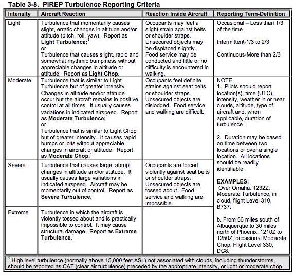
Pilot Weather Reports (PIREP)
No report is timelier than the one made from the flight deck of aircraft in flight. In fact, aircraft in flight are the only means of observing actual icing and turbulence conditions. … Pilots should report any observation, good or bad, to assist other pilots with flight planning and preparation. If conditions were forecasted to occur but not encountered, a pilot should also report this inaccuracy.
Knowledge Tests often have questions on reporting the degree of turbulence. The levels are described in this chart.
Radar
Radar images are graphical displays of precipitation and non-precipitation targets detected by weather radar. WSR-88D Doppler radar displays these targets on a variety of products which can be found on the internet on the National Weather Service (NWS) Doppler Radar Images web site.
The colors on radar images represent different echo reflectivities (intensities) measured in dBZ
(decibels of Z). The dBZ values increase based on the strength of the return signal from targets
in the atmosphere. Each reflectivity image includes a color scale that represents a correlation
between reflectivity value and color on the radar image.
Base Reflectivity
Base Reflectivity is a display of both the location and intensity of reflectivity data. Base Reflectivity images encompass several different elevation angles (tilts) of the antenna. The Base Reflectivity image currently available on the ADDS website begins at the lowest tilt angle (0.5°), more specifically 0.5° above the horizon.
The Base Reflectivity product can be used to determine the location of precipitation and non- precipitation echoes, the intensity of liquid precipitation, and the general movement of precipitation when animating the image.
Composite Reflectivity
Composite reflectivity is the maximum echo intensity (reflectivity) detected within a column of the atmosphere above a location. The radar scans through all of the elevation slices to determine the highest dBZ value in the vertical column then displays that value on the product. When compared with Base Reflectivity, the Composite Reflectivity can reveal important storm structure features and intensity trends of storms….The primary use of the Composite Reflectivity product, which offers the highest reflectivity value in a vertical column, is to determine the vertical structure of the precipitation.
Satellite
Satellite is perhaps the single most important source of weather data world wide, particularly over data sparse regions such as countries without organized weather data collection and the oceans.
GOES satellite imagery can be found on the NWS Aviation Digital Data Service (ADDS) website.
Imagery Types
Three types of satellite imagery are commonly used: Visible, infrared (IR), and water vapor. Visible imagery is available only during daylight hours. IR and water vapor imagery are available day or night.
Visible Imagery
Visible imagery displays reflected sunlight from the Earth’s surface, clouds, and particulate matter in the atmosphere. These images are simply black and white pictures of the Earth from space. During daylight hours, visible imagery is the most widely used image type.
Infrared (IR) Imagery
Infrared (IR) images display temperatures of the Earth’s surface, clouds, and particulate matter. Generally speaking, the warmer an object, the more infrared energy it emits. The satellite sensor measures this energy and calibrates it to temperature using a very simple physical relationship.
Clouds that are very high in the atmosphere are generally quite cold (perhaps -50°C) whereas clouds very near the earth’s surface are generally quite warm (perhaps +5°C). Likewise, land may be even warmer than the lower clouds (perhaps +20°C). Those colder clouds emit much less infrared energy than the warmer clouds and the land emits more than those warm clouds.
The data measured by satellite is calibrated and colorized according to the temperature. If the temperature of the atmosphere decreases with height (which is typical), cloud-top temperature can be used to roughly determine which clouds are high-level and which are low-level.
When clouds are present, the temperature displayed on the infrared images is that of the tops of clouds. When clouds are not present, the temperature is that of the ground or the ocean.
Water Vapor Imagery
The water vapor imagery (Figure 4-25 and Figure 4-26) displays the quantity of water vapor generally located in the middle and upper troposphere within the layer between 700 millibars (FL100) to 200 millibars (FL390). The actual numbers displayed on the water vapor images correspond to temperature in degrees Celsius. No direct relationship exists between these values and the temperatures of clouds, unlike IR imagery. Water Vapor imagery does not really “see” clouds but “sees” high-level water vapor instead. The most useful information to be gained from the water vapor images is the locations and movements of weather systems, jet streams, and thunderstorms.
In general, regions displayed in shades of red are VERY dry in the upper atmosphere and MAY correlate to crisp blue skies from a ground perspective. On the contrary, regions displayed in shades of blue or green are indicative of lots of high-level moisture and may also indicate cloudiness. This cloudiness could simply be high-level cirrus types or thunderstorms.
GRAPHICAL OBSERVATIONS AND DERIVED PRODUCTS
Surface Analysis Charts
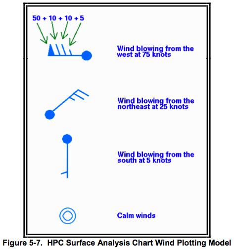
Surface Analysis charts are analyzed charts of surface weather observations. The chart depicts the distribution of several items including sea level pressure, the positions of highs, lows, ridges, and troughs, the location and character of fronts, and the various boundaries such as drylines, outflow boundaries, sea-breeze fronts, and convergence lines. Other symbols are often added depending upon the intended use of the chart. Pressure is referred to in mean sea level (MSL) on the surface analysis chart while all other elements are presented as they occur at the surface point of observation. A chart in this general form is commonly referred to as the weather map… [They] are issued eight times daily.
[These symbols are good to know. ]
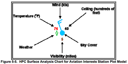
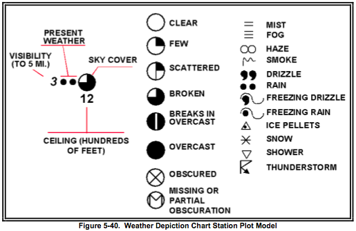
The approximate amount of sky cover can be determined by the circle at the center of the station plot. The amount the circle is filled reflects the amount of sky covered by clouds.
The analysis shows positions and types of fronts by the symbols in Figure 5-2. The symbols on
the front indicate the type of front and point in the direction toward which the front is moving.
Two short lines across a front indicate a change in front type. [Note that that visibility is not reported if it is unlimited and ceilings are only given if they exist.]
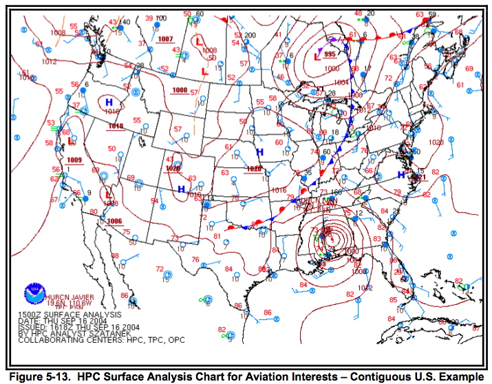
Analyses
Isobars, pressure systems, and fronts are the most common analyses depicted on the surface analysis charts. An isobar is a line of equal or constant pressure commonly used to analyze pressure patterns. [Note: These items are not observations but estimates of weather based on the observations at the reporting stations.]
Constant Pressure Charts
Constant pressure charts are maps of selected conditions along specified constant pressure surfaces (pressure altitudes) and depict observed weather. Constant pressure charts help to determine the three-dimensional aspect of depicted pressure systems. Each chart provides a plan-projection view at a specified pressure altitude.
Height
Heights are analyzed with contours. Contours are lines of constant height in MSL and are used to map height variations of constant pressure surfaces. They identify and characterize pressure systems on constant pressure charts.
Wind speeds are directly proportional to contour gradients. Faster wind speeds are associated with strong contour gradients and slower wind speeds are associated with weak contour gradients. In mountainous areas, winds are often variable on constant pressure charts with altitudes near terrain elevation due to friction.
Temperature
Temperature is analyzed with isotherms which are lines of constant temperature. Temperature gradient is the amount of temperature change over a specified distance. Isotherm gradients identify the magnitude of temperature variations. Strong gradients are denoted by closely spaced isotherms and identify large temperature variations. Weak gradients are denoted by loosely spaced isotherms and identify small temperature variations.
Wind Speed
Wind speed is analyzed with isotachs which are lines of constant wind speed. They are drawn on the 300-mb and 200-mb charts with short-dashed lines at 20-knot intervals beginning with10 knots. They are labeled with a two- or three-digit number followed by a K for knots. Regions of high wind speeds are highlighted by alternate bands of shading and no-shading at 40-knot intervals beginning at 70 knots. A jet stream axis is the axis of maximum wind speed in a jet stream. Jet axes are not explicitly indicated, but their positions can be inferred from the isotach pattern and plotted winds.
Use
Constant pressure charts are used to provide an overview of selected observed weather conditions at specified pressure altitudes.Pressure patterns cause and characterize much of the weather. Typically, lows and troughs are associated with bad weather, clouds and precipitation, while highs and ridges are associated with good weather.
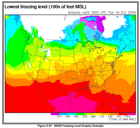
Freezing-level Graphic
The freezing level is the lowest altitude in the atmosphere over a given location at which the air temperature reaches 0ºC. This altitude is also known as the height of the 0ºC constant- temperature surface. A freezing level chart shows the height of the 0ºC constant-temperature surface.
The initial analysis and 3-hour forecast graphics are updated hourly. The 6-, 9-, and 12-hour forecast graphics are updated every three hours.
Freezing level graphics are used to assess the lowest freezing level heights and their values relative to flight paths. Clear, rime and mixed icing are found in layers with below-freezing (negative) temperatures and super-cooled water droplets. Users should be aware that official forecast freezing level information is specified within the AIRMET Zulu Bulletins .
Lifted Index (LI)
The Lifted Index is a common measure of atmospheric stability. The Lifted Index Analysis Chart depicts a number associated with the stability of a surface parcel of air lifted to 500 mb.
Weather Depiction Chart
The Weather Depiction Chart (Figure 5-39) contains a plot of weather conditions at selected METAR stations and an analysis of weather flying category. It is designed primarily as a briefing tool to alert aviation interests to the location of critical or near-critical operational minimums at terminals in the conterminous US and surrounding land areas. The Weather Depiction chart is issued eight times daily.
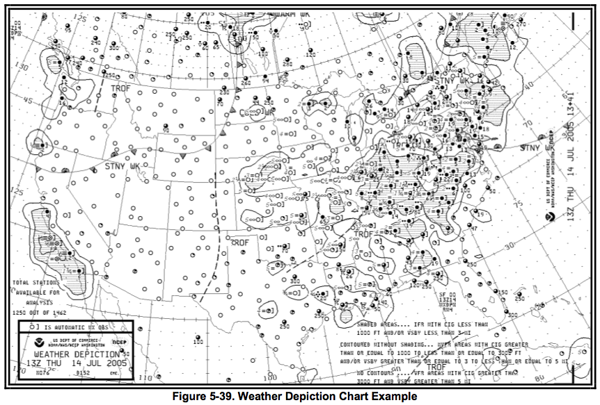
METAR elements associated with weather flying category (visibility, present weather, sky cover, and ceiling) are plotted for each station on the chart.
Weather Flying Category Analysis
Instrument Flight Rules (IFR) indicated on the Weather Depiction Chart represents ceilings less than 1,000 feet and/or visibility less than 3 statute miles and IFR operations must be in place. IFR areas are outlined on the chart with a solid line and are shaded. IFR areas are typically shaded red in colorized versions of the chart.
Marginal Visual Flight Rules (MVFR) indicated on the Weather Depiction Chart represents ceiling 1,000 to 3,000 feet and/or visibility 3 to 5 statute miles and VFR operations can take place. MVFR areas are outlined with a solid line, but the area is not shaded. MVFR areas are typically shaded blue in colorized versions of the chart.
Visual Flight Rules (VFR) indicated on the Weather Depiction Chart represents a ceiling greater than 3,000 feet or clear skies and visibility greater than 5 statute miles and VFR operations can take place. VFR conditions are not analyzed. This does not necessarily imply that the sky is clear.
Use
The Weather Depiction Chart is an ideal place to begin flight planning or to prepare for a weather briefing. This chart provides an overview of weather flying categories and other adverse weather conditions for the chart valid time. The chart, though, may not completely represent the en route conditions because of terrain variations and the possibility of weather occurring between reporting stations. This chart should be used in addition to the current METAR reports, pilot weather reports, and radar and satellite imagery for a complete look at the latest flying conditions.
Radar Summary Chart
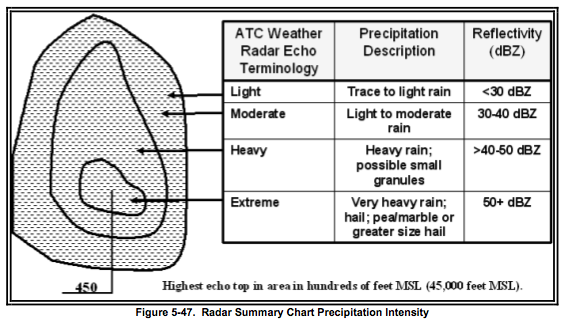
The Radar Summary Chart (Figure 5-49) is a computer-generated mosaic of radar echo intensity contours based on Radar Weather Reports (Section 2.3) over the contiguous U.S. Possible precipitation types, cell movements, maximum tops, locations of line echoes, and remarks are plotted on this chart. Much of this information is often truncated due to space limitations. Severe thunderstorm and tornado watches are plotted if they are in effect when the chart is valid. … The chart is issued hourly. … The Radar Summary Chart depicts precipitation type, intensity, coverage, movement, echoes, and maximum tops.
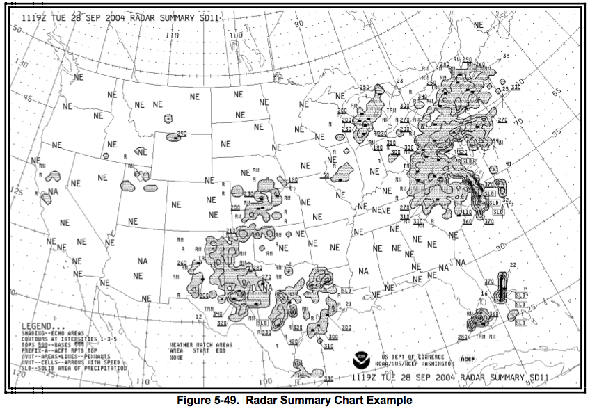
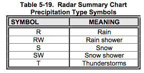
Precipitation Type
The precipitation type, determined by a computer model, is indicated on the chart by symbols located adjacent to the precipitation areas. These symbols (Table 5-20) are not in METAR format. Freezing precipitation is not reported in Radar Weather Reports and, thus, not plotted on the Radar Summary Chart.
Cell Movement
Cell movement is the average motion of all cells within a configuration. An arrow indicates direction of cell movement. Speed in knots is entered near the arrowhead. LM identifies little movement. Movement of areas and lines can be significantly different from the motion of the individual cells that comprise these configurations.
MaximumTop
Tops are plotted in 3-digit groups representing height in hundreds of feet MSL and are underlined. Where it is necessary to offset a top for reasons of insufficient space, a line is drawn from one end of the underline to a small black square which represents the location of the top. Maximum echo top does not equal maximum cloud top. The maximum echo top is the altitude of the highest light precipitation echo, not highest cloud top.
Weather Watch Areas
Heavy dashed lines outline Tornado (WT)and Severe Thunderstorm (WS) Watch areas. The type of watch and the watch number are enclosed in a rectangle and positioned as closely as possible to the northeast corner of the watch. If there is no room at the northeast corner of the watch, the watch information is offset and connected to the watch by a thin line.
Use
The Radar Summary Chart aids in preflight planning by identifying areas of precipitation and highlighting its characteristics. This chart displays precipitation only; it does not display clouds, fog, fronts, or other boundaries. Therefore, the absence of echoes does not equal clear weather. Cloud tops will be somewhat higher than precipitation tops detected by radar. The chart must be used in conjunction with other charts, reports, and forecasts.
The radar summary chart is for preflight planning only and should always be cross-checked and updated by current WSR-88D images. Once airborne, the pilot must evade individual storms by in-flight observations. This can be done by using visual sighting or airborne radar as well as by requesting weather radar information from En route Flight Advisory Service “Flight Watch” briefers at Automated Flight Service Station (AFSS). AFSS Flight Watch briefers have access to current weather radar imagery.